Spotify Redesign
In this conceptual project, I updated and enhanced the design of a Spotify landing page while maintaining its original structure. The focus was on modernizing the aesthetic, improving accessibility, and creating a more intuitive user experience, especially for first-time visitors and those considering Spotify Premium.
Design Choices
Using Figma, I recreated the existing page structure while exploring new visual approaches to improve user flow. The goal was to retain the familiar navigation but create a more engaging interface that draws users in.
During the redesign of the Spotify website and mobile version, I updated several elements to improve the overall user experience. This included modifying page margins and spacing to ensure a more consistent and pleasing layout. I also refreshed the color scheme to make it more visually appealing and on-brand. In addition, I refined the displays for Spotify's premium plans, as well as the content, to make it easier for users to understand the different options available to them.
These changes were all designed to enhance the usability and accessibility of Spotify's platform, for a better experience for its users.
-
I reduced the left and right margins on the page to maximize the available space and improve the overall layout. By minimizing the margins, the content displayed on the page feels less cramped.
-
I ensured that there was consistent spacing between all the elements.
-
I aimed to create a more spacious and breathable layout by removing any heavy or dark elements from the page. When redesigning the page, I wanted to maintain a sense of continuity with the original design by using the same colors throughout. However, I also wanted to update the look and feel of the page by incorporating more modern design elements, such as color gradients.
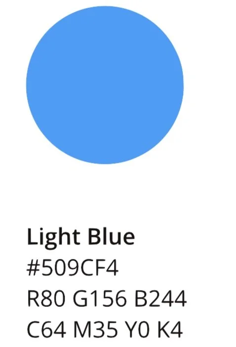
To achieve this, I used the colors used on the original page and selected a few key shades to incorporate into my color palette. I then used these colors to create a gradient that I could apply throughout, to give the page a cohesive and contemporary look.
-
By removing nonessential information and focusing on clear and concise messaging, I aimed to create a more streamlined and intuitive user experience.
To create a clear hierarchy for the information in the design, I used sizing and bolding techniques to visually guide the user's attention and highlight the most critical information. This approach not only enhances the readability of the design but also helps to establish a logical flow of information for the user to follow and make what plan is best for them.
Icons
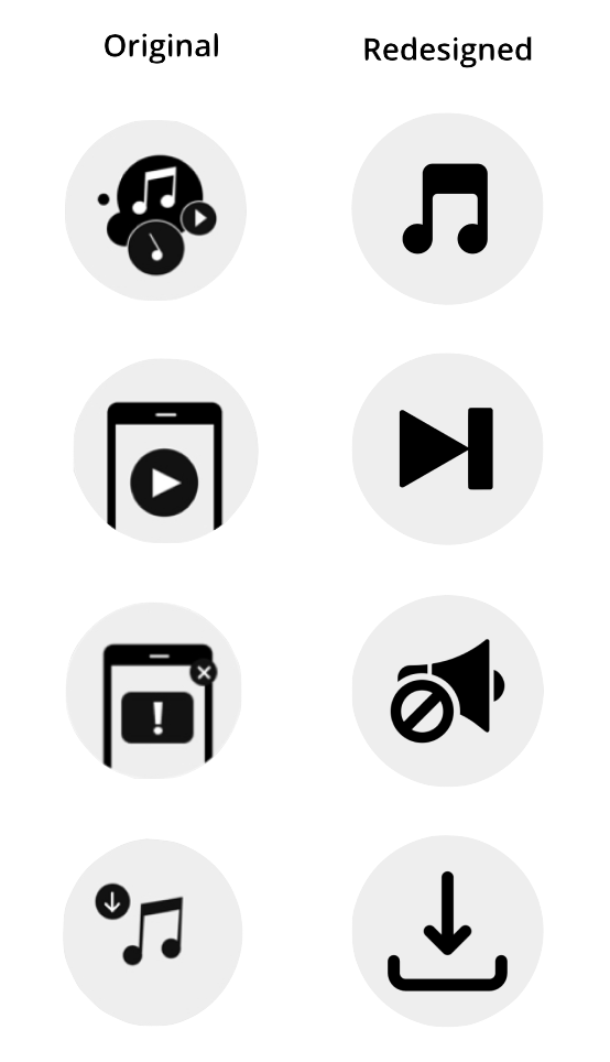
For the icons, I decided to update them to have a more minimalist and user-friendly design. The previous icons had many little elements, which could be overwhelming and difficult to decipher. With the new design, I removed unnecessary details and made the icons more streamlined and easy to recognize. I believe that this redesign will improve the user experience and make the ‘Why go Premium’ section more accessible to everyone
Branding
Colors
Font
Spotify Design Guidelines advice designers to use default sans-serif for the platform. In most cases, sans serif fonts are more accessible for screen reading.
Logo
By retaining the original structure while refining the design, I created a landing page that feels both familiar and refreshed. The updates improved the visual appeal, accessibility, and overall user experience, while ensuring consistency with Spotify's well-known branding.


